
Nvidia Synapse
Knowledge workers spend a surprising amount of time reconstructing context—piecing together information from Slack threads, Jira tickets, meeting notes, dashboards, and institutional knowledge scattered across disconnected systems. As part of a 20-week HCI capstone sponsored by NVIDIA, my team explored how AI could help employees regain context, stay aligned, and focus on meaningful work.
Through stakeholder research, we realized the challenge extended beyond information overload. The real burden wasn't simply having too much information—it was the continuous mental effort required to find it, verify it, prioritize it, and connect it before meaningful work could begin.
+
Developed the Dovetail codebook and research synthesis framework
+
Created interview guides and facilitated ideation workshops with teammates and proxy users
+
Translated research into product strategy and design direction
CONTEXT
Questioning the Brief

The initial framing centered on information overload, defined as "the growing difficulty of navigating communication, documentation, and collaboration across an expanding ecosystem of workplace tools".
Rather than immediately designing around the proposed solution, we treated both the problem and the solution as hypotheses to validate through research.
Early secondary research raised concerns about conversational digital humans at work. Literature on conversational AI and the uncanny valley suggested that highly anthropomorphic assistants could add friction.
Despite the technical promise of digital humans, we questioned whether they fit everyday enterprise workflows.
RESEARCH
Understanding the Work Behind the Work
Across nine stakeholder interviews with product managers and engineers, our understanding of the problem began to shift.
INSIGHT 001
One conversation with a technical project manager became a turning point. She described how much of her day was spent triaging—deciding who to respond to, which requests could wait, and what aligned with constantly changing organizational priorities. The challenge wasn't simply receiving too much information; it was continuously making decisions about what deserved attention.


INSIGHT 002
In most of our interviews, we heard how stakeholders spent the first hour each morning catching up on overnight updates from other time zones, and about 30 minutes each evening planning the next day’s priorities so they wouldn’t forget key work.
Returning from vacation presented another recurring challenge. Participants spoke about apologizing for being "out of the loop" before rebuilding enough context to contribute again. Catching up wasn't a quick review—it was work in itself.
Perhaps the most revealing moment came when one participant reflected on trying to exercise after work.
Initially, we interpreted this as evidence of burnout. But burnout wasn't something we could directly design away. It was an outcome influenced by many overlapping factors, only some of which technology could meaningfully improve.
INSIGHT 003
Despite having access to enterprise tools designed for collaboration, participants still relied on handwritten planners, personal notebooks, Notion pages, and individual task trackers to keep themselves organized. Rather than trusting their digital ecosystem to maintain continuity, they created personal memory systems to compensate.
SCOPING
Reframing the Problem
We realized we’d been solving symptoms, not the underlying work.
Information overload described what people saw. Burnout described how they felt. Neither captured the day-to-day effort in between.
Across interviews, we kept seeing the same pattern: before anyone could act, they had to rebuild context—what changed, why it matters, and what to do next (after meetings, time away, time-zone handoffs, shifting priorities).
Context Burden
The cognitive effort to reconstruct, maintain, and carry work context across fragmented tools, conversations, and time.
Designing for Context Continuity
Our research reframed the problem, but it didn't prescribe a solution. As we transitioned into ideation and prototyping, we distilled our findings into a simple design philosophy:
Design Objective
Reduce the cognitive effort of interacting with work.
That reframing shifted Synapse from “another productivity tool” to a collaborative workspace that helps people spend less time rebuilding context and more time acting.
Rather than asking what features an AI assistant should have, we asked:
How can we reduce the effort of getting started?
How can we reduce the effort of reconnecting after interruptions?
How can we reduce the effort of prioritizing work?
How can we reduce the effort of verifying information?
How can we reduce the effort of moving between enterprise systems?
Every feature we designed became a response to one of those questions.
DESIGNS
Conversational Workspace


Reducing the Cost of Getting Started
Employees often didn’t know where to begin. Before acting, they needed quick clarity on what changed, what matters, and what to ask next.
I designed the Conversational Workspace as Synapse’s main entry point: a lightweight chat interface that pairs natural language with proactive context so people spend less time rebuilding a mental model and more time acting.
Instead of dashboards, the homepage uses suggested prompts and context widgets to support common workflows (catch up, prep for meetings, schedule check-ins, review priorities) while still allowing open-ended questions.
Conversation becomes the organizing layer—users describe an intent, and Synapse routes them to the right context across tools.


Calendar Workspace


Bringing Work Back Into One Timeline
Employees weren’t just managing meetings; they were rebuilding context across disconnected tools (calendar, chat, docs, tickets, and personal notes). I designed the Calendar Workspace as a unified work timeline, bringing together:
Meetings
Tasks & deadlines
Key updates from connected systems
This gives users a single place to see what’s happening and what needs attention, with quick links back to each source.
01
Unified meetings, tasks, and deadlines within a single timeline.
02
Allowed users to customize which enterprise systems contribute to their workspace.
03
Prioritized quick access back to source applications rather than recreating their functionality.
04
Meeting cards can expand for more context, while tasks and events stay actionable.
Notification Panel

Reducing the Cost of Catching Up
Another recurring theme from our interviews was the amount of time employees spent catching up after meetings, overnight updates, or time away from work. Rather than opening each enterprise application individually, I designed the Notification Panel as a centralized stream of organizational activity.
By combining AI-generated summaries with a chronological activity feed, the Notification Panel supports rapid context reconstruction while maintaining transparency and user control.
01
Consolidated updates from multiple enterprise tools into a single activity stream.
02
Combined AI-generated summaries with raw updates for both speed and transparency.
03
Preserved links back to the original source so users could verify information or continue their work.
Instead of reducing notifications, this experience focused on reducing the effort required to understand them.
Priorities Workspace


Our research showed that staying organized isn’t a static to-do list—it’s continuous triage as priorities shift:
Meetings run long
New requests appear throughout the day
Deadlines move
Unexpected work displaces plans
Rather than another task manager, I designed the Priorities Workspace to help employees reorganize work in real time. Synapse combines:
Personal tasks
Work pulled from connected enterprise tools
It also supports common “personal memory systems” we observed (planners, notebooks, private lists) by enabling conversational task capture—quickly adding tasks in natural language and organizing them alongside existing work.
One insight that emerged during ideation was that prioritization happens at different time scales.
Sometimes employees need to focus only on today's work. Other times they need a broader view to rebalance their week around changing deadlines, meetings, and organizational priorities.
To support both planning and execution, I designed two complementary views that supported different cognitive modes depending on where users were in their workflow.
+
Today focused on execution by minimizing visual complexity and helping users concentrate on immediate work.
+
Week focused on planning, allowing users to reorganize priorities, reschedule work, and better understand workload across time.
USABILITY TESTING
Iterating Through Validation


To validate both the interaction model and our design principles, we conducted 5 moderated usability tests using an interactive Figma prototype, alongside weekly design critiques with NVIDIA stakeholders.
Participants completed three realistic workplace scenarios:
catching up on daily updates
resolving scheduling conflicts
coordinating meetings across teams
Rather than evaluating navigation alone, we focused on whether users understood the AI's recommendations, trusted its reasoning, and could efficiently complete common workplace tasks.
Our goal was to answer a simple question:
Does Synapse reduce cognitive effort without sacrificing transparency or user control?
Key Learnings from Testing
INSIGHT 001
Transparency Builds Trust
Participants consistently appreciated that Synapse explained its recommendations rather than simply presenting answers. They valued seeing summaries, supporting context, and AI reasoning alongside suggested actions, reinforcing our belief that transparency should be a core part of the interaction—not an afterthought.
INSIGHT 002
Familiar Mental Models Reduce Cognitive Effort
While participants responded positively to the meeting scheduling flows, several expected recommendations to be presented in a familiar calendar layout rather than purely conversational cards. This reinforced the importance of leveraging existing mental models when designing AI-assisted workflows.
INSIGHT 003
Context Needs Explanation
Although users appreciated having relevant Slack messages, meeting updates, and supporting information surfaced automatically, several questioned why particular pieces of context appeared alongside a recommendation.
The issue wasn't the relevance of the information—it was the lack of explanation.
This reinforced one of our strongest takeaways: surfacing context alone isn't enough. AI should also communicate why that context matters.


LOOKING FORWARD
Revisiting Synapse as a Contextual Assistant
After the capstone, I revisited one core assumption: Synapse as a standalone destination.
We chose that model to keep scope manageable while exploring how AI could support context reconstruction and decision-making—even though early ideation included a lightweight desktop assistant.
Months later, I revisited the concept through a different lens and asked:
If Synapse reduces the cognitive effort of interacting with work, why should users have to leave their work to use it?
That question brought back an idea we had deprioritized: a contextual assistant that lives alongside the user’s workflow, not in place of it.

An early sketch of this widget-based concept
Designing for Presence, Not Navigation
Reimagining Synapse as a contextual assistant changed the interaction model:
No page-hopping: conversation, priorities, calendar, and upcoming events live in one lightweight surface.
Stays in your workflow: the assistant sits alongside what you’re already doing.
Less friction, not more features: reduced navigation was the main win.
The result felt less like another app and more like a companion you can summon anytime—better aligning with our core principle:
Reduce the cognitive effort of interacting with work.
The Next Design Challenge
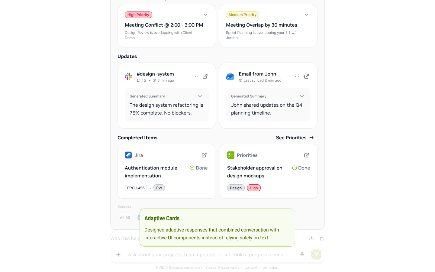
Revisiting Synapse changed how I think about AI interactions. In the capstone, adaptive cards were mostly structured outputs. Now I see them as reusable interaction patterns that make conversation more actionable.
If I continued developing Synapse, I’d focus on adaptive cards for specific workplace workflows, including:
Scheduling & rescheduling
Meeting prep
Context summaries
Forms & approvals
Project updates
Task & priority management
The goal: help users review, compare, decide, and act—without leaving the conversation.
Reflection
Looking back, revisiting Synapse reinforced something I learned throughout the project: good AI experiences aren't defined by how many features they include—they're defined by how little effort they require from the people using them.
The project began as an exploration of AI assistants for enterprise work, but it fundamentally changed the way I think about designing AI products.
Today, I spend less time asking "What can AI automate?" and more time asking:
"Where is the cognitive effort, and how can design reduce it while keeping people in control?"
That question continues to shape how I approach AI product design in my professional work today.